
Tanda is an online employee scheduling software. Cubiko integrates with Tanda to provide detailed insights into your labour costs.
To navigate to the Tanda Cabinet, go to Integrations > Tanda

The sections in this article are broken down into the following areas that you can dive into for further insights.
NOTE: You can use the Filter on the left-hand side to change the view to Predicted (Future Tanda Metrics) or Historical as you desire.

Historical View:
- Historical Labour Cost
- Historical Doctor hours per Reception hour
- Historical Doctor hours per Nurse hour
- Historical labour cost as a % of practice total billings
Predicted View:
Historical Labour Cost
This figure represents the cost of staff based on their timesheets and how it compares to what was rostered, during the selected time period.  Click this tile to see more detail about Historical Labour costs:
Labour cost by Employee
This figure represents the cost of your staff based on their timesheets and how it compares to what they were rostered to work, during the selected time frame.

Top Tip! Use this metric to see if you have any team members that work more than their rostered hours over the specified Date Range. Is this a once off or do you need to review the rostering/workloads to reduce overtime obligations?
Labour cost
This figure represents the cost of your staff based on their timesheets and how it compares to what was rostered, for the selected time period.

Trend of labour cost
This figure represents the total cost of your staff based on their timesheets and how it compares to what was rostered for the selected time period. By changing the "Group by:" setting of the graph, you can see this trending down by day, week, or month.
Top Tip! Use the trend graph to see if there are any days or trends where the Actual labour cost is higher than the Rostered Labour cost. Do you need to review your rostering? Is there something happening on those days resulting in team members working overtime?
If you wish to expand the date range, use the Date Range filter on the left-hand side for this.
Labour cost by department
This figure represents the cost of your departments based on their timesheets for the selected time frame.

Top Tip! Changing to "Predicted" will show you Rostered Labour Cost for the next week so you can plan ahead.
Rostered Labour Cost
This figure represents the cost of your staff based on their rosters for the selected time period.

Click to see this broken down by employee or department and how labour costs will change over time.
- Rostered labour cost by Employee
- Rostered labour cost
- Trend of labour cost
- Rostered labour cost by department
Rostered labour cost by Employee
This figure represents the cost of your staff based on their rosters for the selected time period.

Top Tip! Understand which team member is costing your Practice the most, and ensure that their duties are aligned. For example, is your higher-paid Practice Manager working at the front desk for prolonged periods?
Rostered labour cost
This figure represents the cost of your staff based on their rosters for the selected time period.

Trend of labour cost
This figure represents the total cost of your staff based on their rosters for the selected time period.

Top Tip! Set up your rosters in advance, so you can see the rostered labour cost and if there are any days coming up with higher than normal labour costs.
Rostered labour cost by department
This figure represents the cost of your departments based on their rosters for the selected time frame

Historical Doctor hours per Reception hour
This figure represents the ratio of Doctor session hours to hours worked by receptionists. Doctor hours are based on session hours from Best Practice and receptionist hours are based on timesheets from Tanda.
 Click this tile to see more detail about Historical Doctor hours per Reception hour:
- Doctor hours per Receptionist hour by day
- Total Doctor Hours
- Total Receptionist Hours
- Trend of Doctor hours per Receptionist hour
- Session hours by Doctor
- Shifts by Receptionist
- Doctor hours per Receptionist hour
Doctor hours per Receptionist hour by day
This figure represents the ratio of doctors who worked, to the number of receptionists for each day. Doctor hours are based on session hours from your PMS and receptionist hours are based on timesheets from Tanda.
Example as below: on Friday 9th Jan, the reception team had the highest volume of Doctors to look after at 1.37 Drs per receptionist hours. The darker the squares, the more heavily utilised the reception team were indicated to be.

Top Tip! Not all practices are created equally, what do you think your ideal Doctor to Reception ratio is? Use this data to ensure that you are meeting your Practice goals, which will affect budgeting as well as staff morale.
Total Doctor Hours
This figure represents the total number of hours doctors worked in the selected time frame. This is based on each doctor's sessions. Click to see more details on how many hours your doctors worked.

Top Tip! Head to this page if you want to understand more about how we calculate hours at Cubiko.
Total Receptionist Hours
This figure represents the total number of hours receptionists worked in the selected time frame. This is based on each receptionist's timesheet.

Trend of Doctor hours per Receptionist hour
This figure represents how the ratio of doctors who worked to receptionists has changed over time.
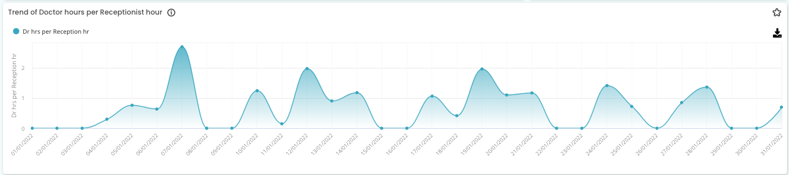
Top Tip! If you are making some changes to your ratios, keep an eye on this trend line and add it to your favourites dashboard, as these changes could be impacting other areas of your Practice, e.g. DNA rate, or other tasks that your Reception team need to dedicate time towards.
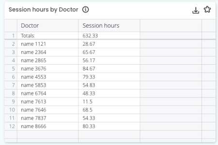
Session hours by Doctor
This figure breaks down how many hours each doctor has worked in the selected time frame. This is based on each doctor's sessions.
Shifts by Receptionist
This figure breaks down how many hours each receptionist has worked in the selected time frame. This is based on each receptionist's timesheets.


Top Tip: Changing your filter to "Predicted" will show you Rostered Doctor hours per Reception hour for the next week.
Rostered Doctor hours per Reception hour
This figure represents the ratio of doctors working to receptionists rostered on for the selected time frame. Doctor hours are based on session hours from Best Practice and receptionist hours are based on rosters from Tanda.

Click to see a daily breakdown of this ratio and how many hours each doctor and receptionist are rostered to work:
- Rostered Doctor hours per Receptionist hour by day
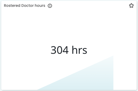
- Rostered Doctor hours
- Rostered Receptionist hours
- Trend of Doctor hours per Receptionist hour
- Session hour by Doctor
- Rostered hours by Receptionist
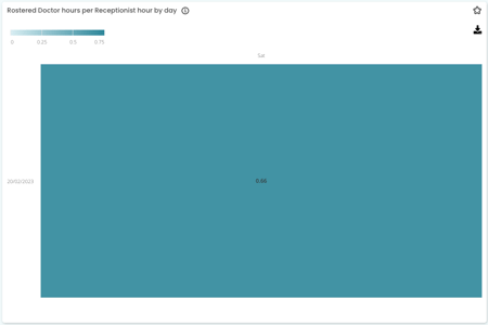
- Doctor hours per Receptionist hour
This figure represents the ratio of doctors working to receptionists rostered on to work, for each day. Doctor hours are based on session hours from Best Practice and receptionist hours are based on rosters from Tanda.
This figure represents the total number of hours doctors are rostered to work in the selected time frame. This is based on each doctor's sessions.

Rostered hours by Receptionist
This figure breaks down how many hours each receptionist is rostered to work in the selected time frame. This is based on each receptionist's roster.

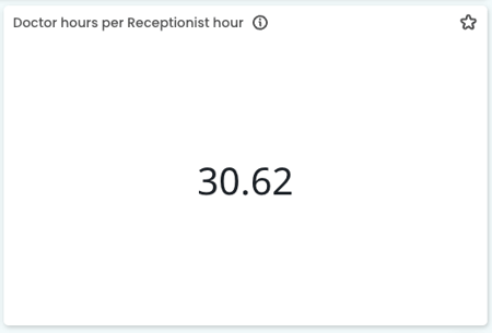
Doctor hours per Receptionist hour
This figure represents the ratio of doctors who worked to receptionists. Doctor hours is based on session hours from Best Practice and receptionist hours is based on timesheets from Tanda.
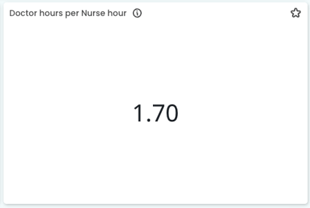
Historical Doctor hours per Nurse hour
This figure represents the ratio of Doctor's session hours to hours worked by Nurses. Doctor hours are based on session hours from Best Practice and Nurse hours are based on timesheets from Tanda.
 Click this tile to see more detail about Historical Doctor hours per Nurse hour:
- Doctor hours per Nurse hour by day
- Today Doctor Hours
- Total Nurse Hours
- Trend of Doctor hours per Nurse hour
- Session hours by Doctor
- Shifts by Nurse
- Doctor hours per Nurse hour
Doctor hours per Nurse hour by day
This figure represents the ratio of Doctors who worked, compared to the number of nurses who worked each day. Doctor hours are based on session hours from Best Practice and nurse hours are based on timesheets from Tanda.
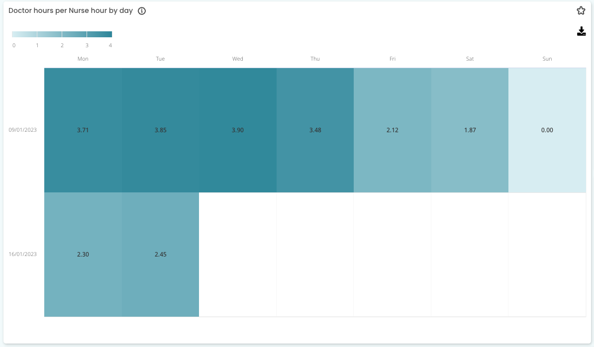
The darker squares indicate that your nurses are more heavily utilised.
Top Tip! Ensure that you are not applying 'stock standard' ratios to these metrics and that your Nurse capacity is evaluated based on their capacity and experience.
Total Doctor Hours
This figure represents the total number of hours doctors worked in the selected time frame. This is based on each Doctor's sessions. Click to see more details on how many hours your doctors worked.
Top Tip! Head to this page if you want to understand more about how we calculate hours at Cubiko.
Total Nurse Hours
This figure represents the total number of hours nurses worked in the selected time frame. This is based on each nurse's timesheet.

Top Tip! This is a great metric to have side by side in your favourites dashboard, to understand how this is impacting other areas of your Practice, such as utilisation or CDM billings.
Session hours by Doctor
This figure breaks down how many hours each doctor has worked in the selected time frame. This is based on each Doctor's sessions.
Shifts by Nurse
This figure breaks down how many hours each nurse has worked in the selected time frame. This is based on each nurse's timesheet.


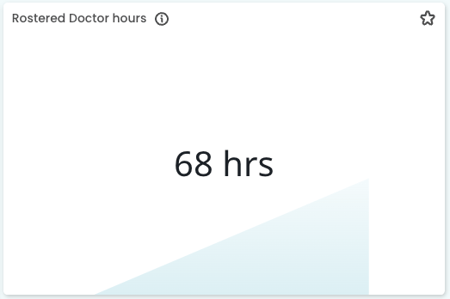
Top Tip: Changing to "Predicted" will show you Rostered Doctor hours per Nurse hour for the next week (Below)
Rostered Doctor hours per Nurse hour
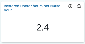
This figure represents the ratio of doctors working to nurses rostered on for each day. Doctor hours are based on session hours from Best Practice and nurse hours are based on rosters from Tanda.

Top Tip! Look ahead using these metrics to understand if you have a lower Doctor to Nurse Ratio. If there is extra nursing capacity, is there an opportunity to engage with patients using our Item Optimisation cabinet?
Rostered Doctor hours
This figure represents the total number of hours Nurses are rostered to work in the selected time frame. This is based on each Nurse's roster.

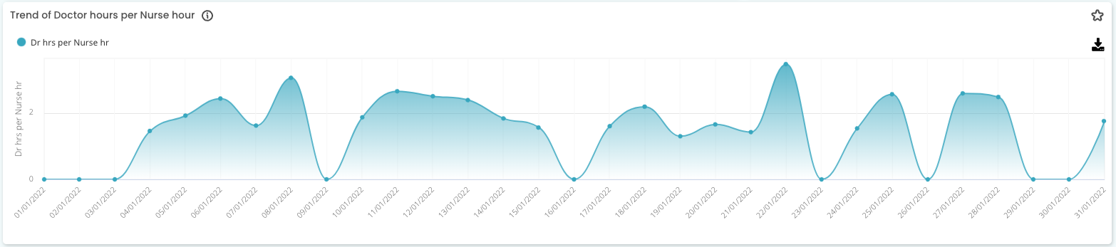
Trend of Doctor hours per Nurse hour

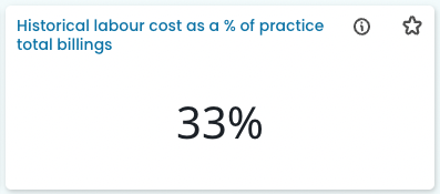
Historical labour cost as a % of practice total billings
This figure represents what proportion of practice total billings are used to pay for your staff over the selected time frame.
Click this tile to see more detail about Historical labour cost as a % of practice total billings:
- Total Labour Cost
- Practice total billings
- Labour cost as a % of practice total billings
- Labour cost as a % of total billing by Employee
- Trend of labour cost as a % of practice total billings
Total Labour Cost
This figure represents the total labour cost for the selected time frame. Click to see this broken down by employee or department and how it compares to what was rostered.

NOTE: Clicking this tile will take you to the Historical Labour Cost metrics.
Practice total billings
This figure represents practice total billings (inclusive of GST, and based on invoice date) for the selected time frame.

NOTE: Clicking this tile will take you to Total billings (by service date)
Labour cost as a % of practice total billings
This figure represents what proportion of practice total billings are used to pay for your staff over the selected time frame.
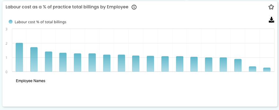
Labour cost as a % of practice total billings by Employee
This figure represents what proportion of practice total billings are used to pay for each of your employees over the selected time frame.
Trend of labour cost as a % of practice total billings
This figure represents how the proportion of practice total billings are used to pay for your staff has changed over time. 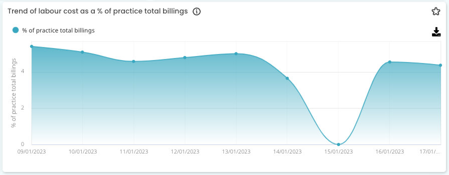
Top Tip! Use this trend graph to see what % of billings are spent on wages at different times of the year. Do you need to consider the impact of public holidays and other events that may decrease billings but fixed labour costs remains the same?